Keystrokes Timeline Guide
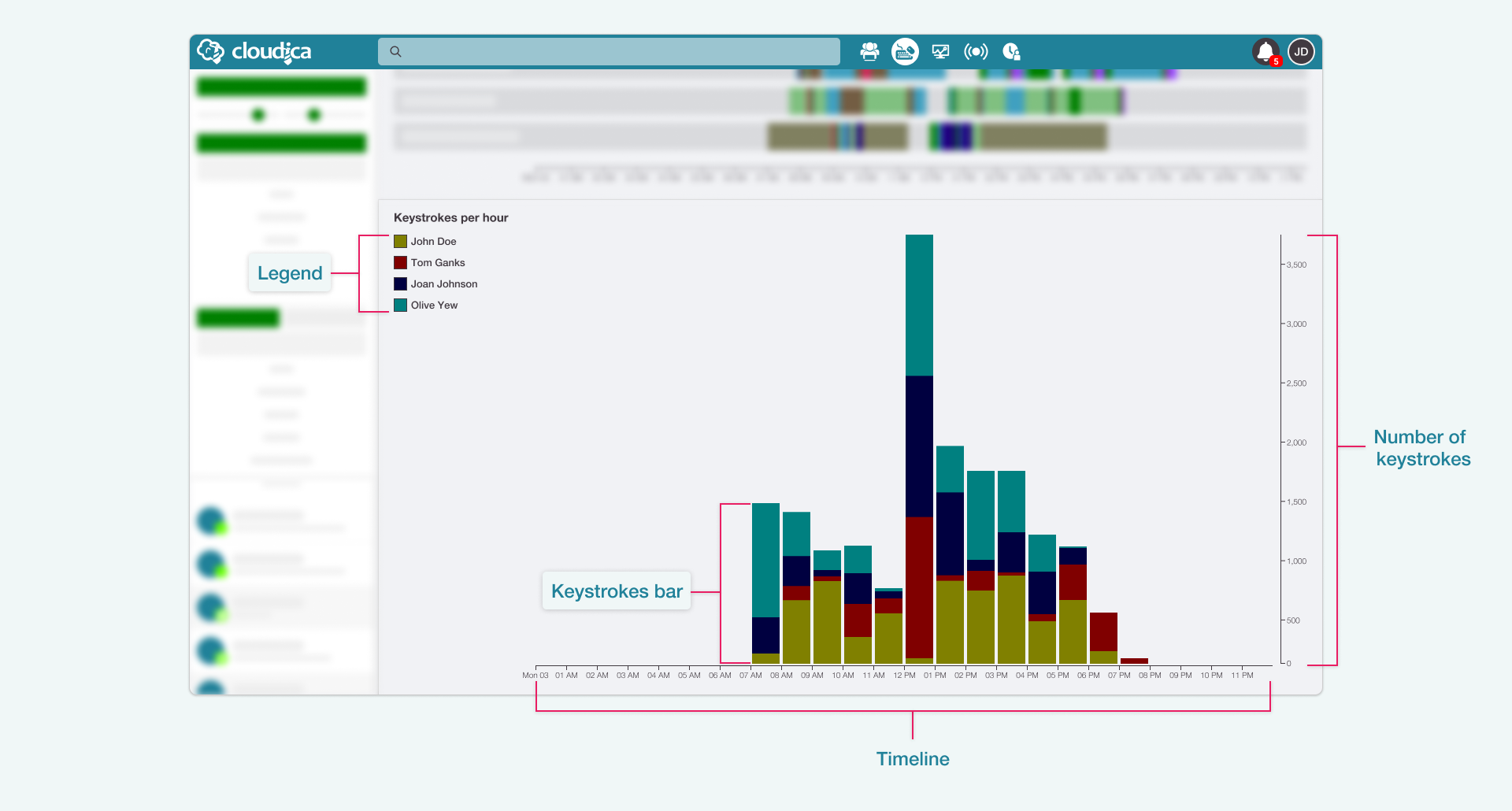
The Keystrokes Timeline gives the user a visual representation of all the users' keyboard usage. The vertical bar graph presents how much users are using their keyboards and at what times they are doing it.
Parts of the Keystrokes Timeline
The Keystrokes Timeline gives the following information:

- TimelineShows the 24-hour horizontal timeline with an hourly interval.
- Number of keystrokesA vertical line indicating an increasing value for the keystrokes.
- LegendDisplays the users and their corresponding color in the graph.
- Keystrokes BarThe visual display of the total keystrokes of user/s within a specific hour. It may consist of different colors, representing the users.
Each user is represented by a color that shows how much captured keystroke data there are.
To view the keystrokes data of each user, you need to:
- Hover over the legendThe user’s keystrokes bars are highlighted in the graph. A tooltip will display the user’s total keystrokes for the entire day.
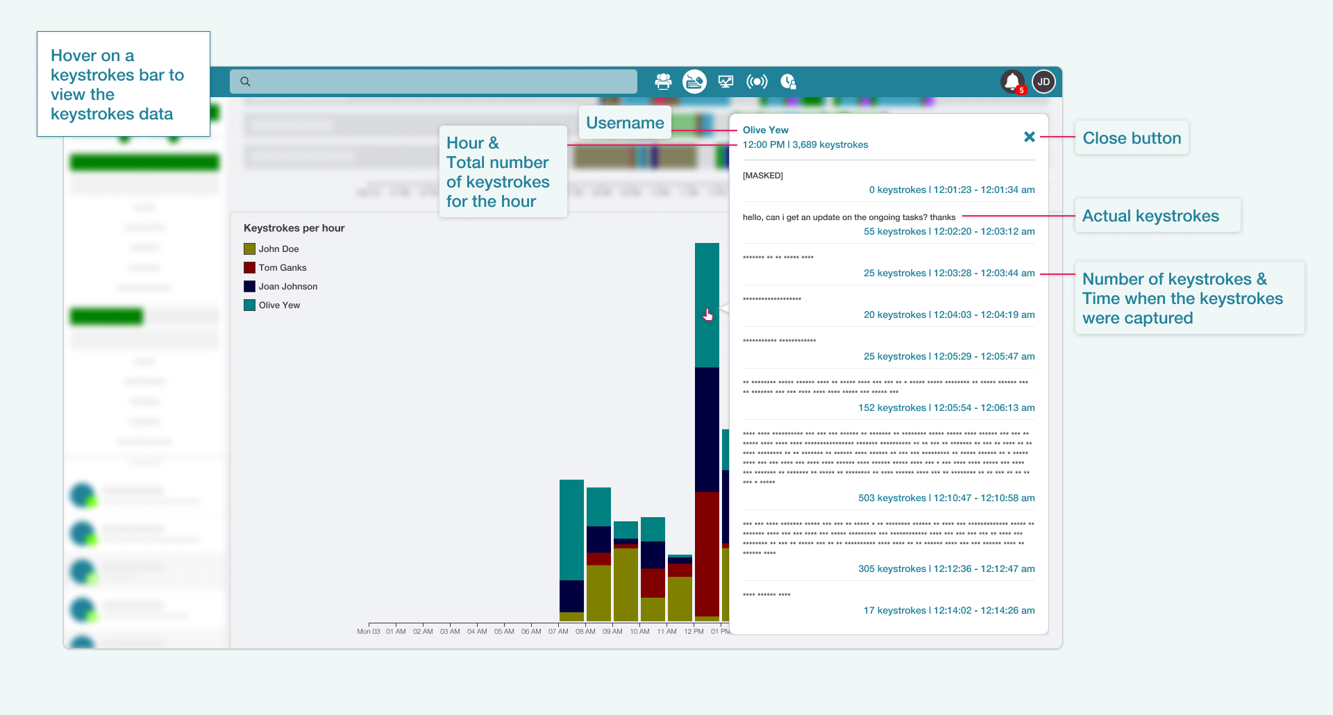
- Hover over the keystrokes barThe Keystrokes data appears. This shows what the user typed in and how much was done per hourly interval.
Parts of the Keystrokes Data
Hovering over a user’s keystrokes bar will display the Keystrokes data. This contains the user’s detailed keystroke information.

- UsernameThe name of the user
- HourThe specific hour duration of the gathered keystrokes
- Total keystrokesThe overall figure for that hour
- Close buttonCloses the keystrokes container
- Actual keystrokesThe recorded keystrokes
- Number of keystrokesThe number of keystrokes captured at a definite time instance
- TimeThe time when the keystrokes were captured
When a user is on Confidential status on the desktop app, you can still view the number of keystrokes per hour. However, the raw keystrokes data are masked.
Check the Computer Activity Quick Guide to learn more.
Copyright © 2025 Cloudica LLC

