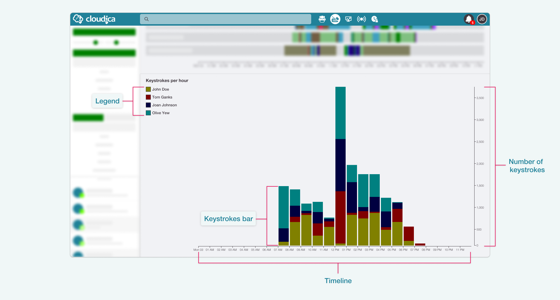
- TimelineShows the 24-hour horizontal timeline with an hourly interval.
- Number of keystrokesA vertical line indicating an increasing value for the keystrokes.
- LegendDisplays the users and their corresponding color in the graph.
- Keystrokes BarThe visual display of the total keystrokes of user/s within a specific hour. It may consist of different colors, representing the users.
- Hover over the legendThe user’s keystrokes bars are highlighted in the graph. A tooltip will display the user’s total keystrokes for the entire day.
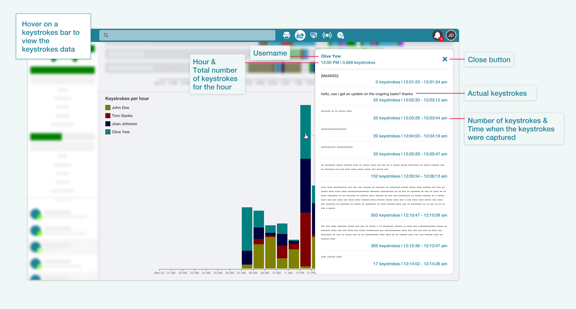
- Hover over the keystrokes barThe Keystrokes data appears. This shows what the user typed in and how much was done per hourly interval.

- UsernameThe name of the user
- HourThe specific hour duration of the gathered keystrokes
- Total keystrokesThe overall figure for that hour
- Close buttonCloses the keystrokes container
- Actual keystrokesThe recorded keystrokes
- Number of keystrokesThe number of keystrokes captured at a definite time instance
- TimeThe time when the keystrokes were captured